®
SHIPSPOTTING.COM
WELCOME TO SHIPSPOTTING.COM
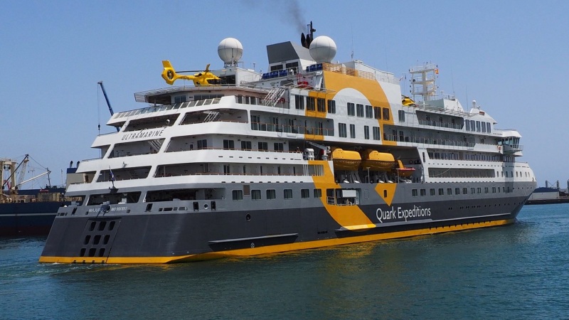
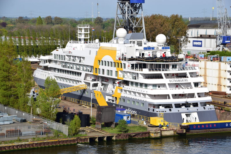
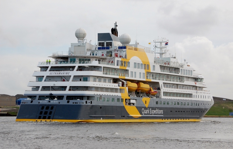
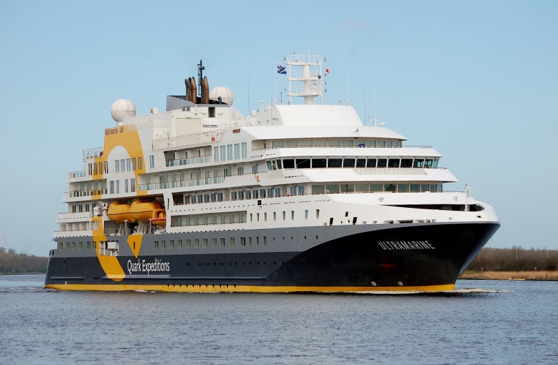
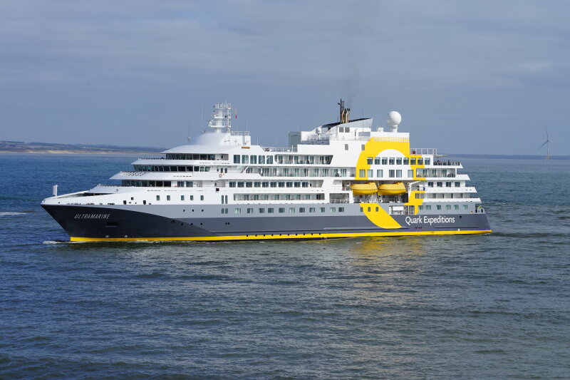
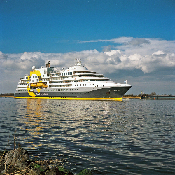
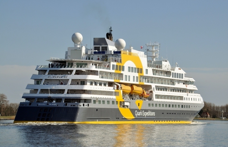
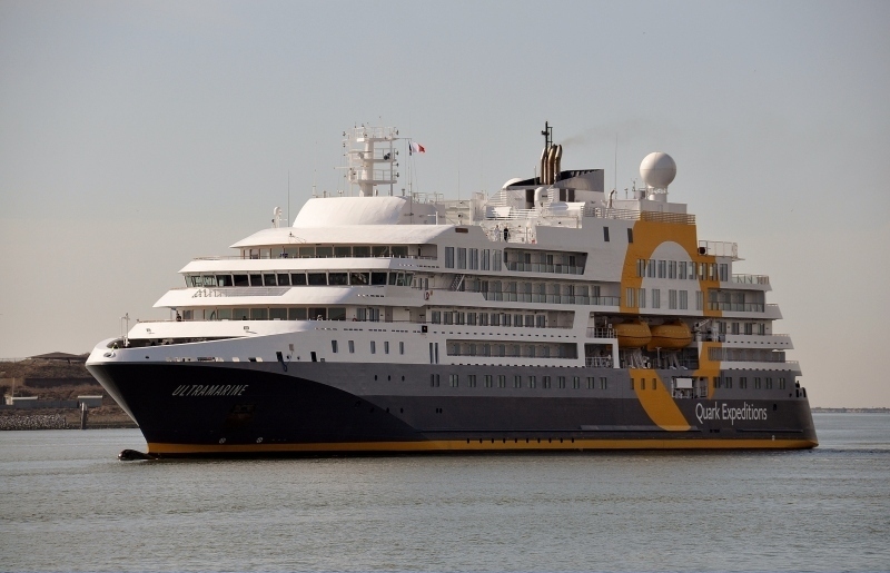
ULTRAMARINE - IMO 9861017

Photo
details
Photographer:Marcel & Ruud Coster [ View profile ]
Captured:Mar 15, 2022
Title:Ultramarine
Location:Ijmuiden, Netherlands
Photo Category:Cruise Ships And Liners Built 2021-2030
Added:Mar 17, 2022
Views:257
Image Resolution:3,067 x 1,983
Description:
IJmuiden
Vessel
particulars
Current name:ULTRAMARINE
Current flag:Marshall Islands
Home port:Majuro
Callsign:V7A4564
IMO:9861017
MMSI:538009302
Status:In Service
Build year:2021
Class society:Registro Italiano Navale
Vessel Type:Passenger (cruise) Ship
Gross tonnage:13,827 tons
Summer DWT:1,445 tons
Length:116 m
Beam:22 m
Draught:7 m
Photos:12 photos by 6 photographers
AIS Position
of this ship
Last known position:78°21’2.77” N, 14°26’45.16” E
Status:
Speed, course (heading):0kts, 278.6° (236°)
Destination:
- Location:Billlefjorden
- Arrival:21st May 2024 / 10:30:01 UTC
Last update:17 minutes ago
Source:AIS (ShipXplorer)
Photo
Categories
This ship exists in the following categories:
Ships under Repair or Conversion - 1 photos
Cruise Ships and Liners built 2021-2030 - 11 photos
Photographers
of this ship
(6)
1 photos
6 photos
1 photos
1 photos
1 photos
2 photos
More of
this ship(11)

COMMENT THIS PHOTO(2)
Edit
comment
Edit
comment